Last year, I was able to do a bit of plating ideas and foodstyling for Aruba Bar and restaurant. We a few layouts for their best-selling dishes, but these are the ones I find the most interesting.
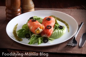
I love this smoked salmon roll salad they have there, but my biggest challenge was to show the inside of the the roll without losing the shape of the salmon which is much like a sausage. Luckily, despite the slippery texture of the lettuce and the salmon, the salad was able to finally “pose” properly when it came down to taking the picture. Plating wise, the client wanted to make it more “chefy”, which is something I haven’t heard from a client in a very long time. Luckily, I am very much familiar with the “chefy” look with all things we plate here in the school.
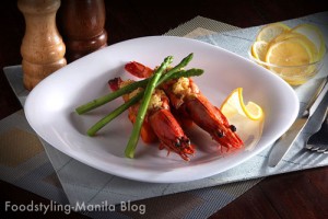
The second redesign is for their prawns thermidor. The old plating had a very stiff, totally symmetrical look that their kitchen followed. I just wanted to soften it up a bit with a little less symmetry and a slight imbalance using the asparagus.







the food dude
Awesome styling! Simple yet elegant, and drool-inducing photos, great job!
giannina
@The Food dude, thanks a lot! 🙂